A book cover is often the first conversation a book has with a reader. Before someone reads a blurb, checks reviews, or flips through the opening pages, they notice the cover. In crowded bookstores, online marketplaces, and social media feeds, that first glance can determine whether a potential reader pauses or scrolls past. For authors and publishers, this makes book cover design one of the most valuable creative investments in the publishing process.
A strong cover does much more than look attractive. It communicates genre, tone, professionalism, and emotional promise. It signals whether a book is suspenseful, romantic, intellectual, playful, or dramatic. In many cases, readers make split-second judgments based on design cues they may not consciously recognize. Fonts, color choices, spacing, imagery, and composition all work together to shape perception.
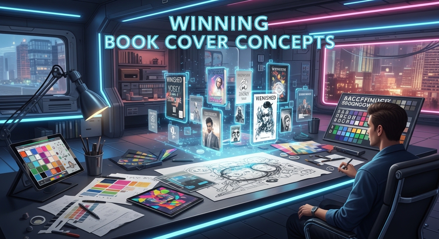
Winning book cover concepts are not accidental. They are carefully designed to capture attention and sustain interest long enough for a reader to take the next step. That next step may be reading the title, clicking on the listing, or purchasing the book. Understanding how successful covers work can help authors create designs that perform in real markets rather than simply pleasing personal taste.
Why Book Covers Matter More Than Ever
In earlier decades, readers often discovered books through physical stores, recommendations, or libraries. Today, digital discovery plays a major role. Online retailers display thousands of books in thumbnail size, where covers must compete in a tiny visual space. Social media has also transformed books into shareable visual products. Readers post “currently reading” photos, curated shelves, and aesthetic recommendations where cover appeal matters greatly.
Because of this shift, covers now need to function in multiple formats. They must look striking in full size, readable in small size, and memorable when seen briefly. A cluttered or outdated design can make even a strong manuscript appear less valuable. Meanwhile, a sharp and genre-appropriate cover can give an unknown author immediate credibility.
Readers often associate cover quality with content quality. While this may not always be fair, it remains a common consumer behavior. A polished cover suggests care, editing, and professionalism. That impression can significantly increase the chance of a sale.
The Psychology Behind Attention-Grabbing Covers
Human attention is selective. We naturally notice contrast, emotion, faces, movement, and novelty. Successful book covers use these principles strategically. A dark background with bright typography creates contrast. A human face with strong emotion invites curiosity. Unusual compositions or symbolic imagery trigger questions in the viewer’s mind.
Color psychology also plays a central role. Red often suggests urgency, passion, or danger. Blue may imply trust, calmness, or intelligence. Black can signal sophistication or mystery. Yellow tends to attract attention quickly and can convey energy or optimism. Designers often choose palettes based on genre expectations and emotional tone.
Typography affects emotional response as well. Elegant serif fonts may suggest literary fiction or historical depth. Bold sans-serif fonts can feel modern and direct. Handwritten styles may create intimacy or creativity. When type choices align with the book’s theme, the cover feels cohesive and convincing.
Core Elements of Winning Book Cover Concepts
The best covers usually balance several essential elements rather than relying on a single trick. Clarity is one of the most important. If the title is hard to read or the message feels confusing, the cover loses impact. Simplicity often outperforms overcrowded designs because the eye can process information quickly.
Hierarchy is equally important. Readers should know where to look first, second, and third. Usually this means title first, image second, author name third, though the order can vary depending on branding. Good hierarchy guides attention smoothly rather than forcing the viewer to search.
Originality matters too. A cover should fit its genre without becoming generic. Readers want signals they recognize, but they also want something fresh. The strongest concepts blend familiarity with surprise.
Emotional resonance completes the equation. A cover should make readers feel something instantly. Intrigue, comfort, excitement, fear, wonder, nostalgia, or desire can all drive engagement.
Book Cover Styles That Consistently Perform
Different visual approaches succeed for different categories of books. Minimalist covers often work well because they use clean space, strong typography, and one dominant image. This style can feel premium and modern, especially for nonfiction and literary titles.
Illustrated covers have become highly popular across fiction categories. They can appear playful, romantic, dramatic, or artistic depending on execution. Illustration allows greater symbolic storytelling than photography in many cases.
Photographic covers remain powerful when the imagery is expertly chosen. Faces, landscapes, or cinematic scenes can create immediate mood. However, generic stock images can weaken credibility if poorly edited or overused.
Typographic covers rely mainly on lettering as the hero element. When done well, they can look bold, memorable, and highly professional. This is especially effective for business books, memoirs, and modern fiction.
Series branding is another high-performing concept. Repeating fonts, layout structures, or color systems across multiple books helps readers instantly identify connected titles.
Genre Expectations and Reader Trust
Each genre has visual conventions that help readers navigate choices quickly. Thriller covers often use dark tones, sharp contrasts, and tense imagery. Romance covers may feature warmth, softness, or emotional intimacy. Fantasy frequently uses ornate typography, atmospheric scenes, and dramatic scale. Business books tend to favor authority, clarity, and bold titles.
Ignoring genre expectations entirely can confuse buyers. If a thriller looks like a romance or a business guide looks like a fantasy novel, readers may skip it. Smart design respects reader expectations while still offering a distinct personality.
Trust is built when the cover accurately represents the reading experience. A humorous book should not look severe. A serious historical account should not feel childish. Honest alignment between cover and content leads to stronger reviews and better reader satisfaction.
Common Mistakes That Reduce Reader Attention
Many covers fail not because of one major flaw, but because of several small ones combined. Weak typography is one of the most common issues. Poor font pairing, awkward spacing, or unreadable text instantly lowers quality perception.
Overcrowding is another problem. Too many images, textures, colors, or taglines create confusion. Instead of attracting attention, clutter repels it.
Low-quality imagery also damages trust. Pixelated graphics, obvious stock photos, or mismatched elements make a book appear amateur. Readers notice design quality quickly.
Some covers are visually attractive but strategically ineffective. They may look artistic while hiding the genre or title. Beauty alone is not enough. A winning cover must communicate and convert.
Table: Effective Book Cover Concepts and Their Impact
| Cover Concept | Best For | Why It Works | Reader Reaction |
| Minimalist Design | Nonfiction, Literary Fiction | Clear and modern presentation | Trust and curiosity |
| Bold Typography | Business, Memoir | Easy to read at thumbnail size | Immediate recognition |
| Character Illustration | Romance, YA, Contemporary Fiction | Emotional and personable | Connection and warmth |
| Cinematic Photography | Thriller, Mystery | Creates tension and drama | Suspense and intrigue |
| Symbolic Imagery | Literary, Fantasy | Invites interpretation | Curiosity and depth |
| Series Branding | Multi-book titles | Builds recognition over time | Loyalty and familiarity |
How Successful Covers Hold Attention
Capturing attention is only the first step. Holding it requires layered interest. A viewer may first notice bold color, then become intrigued by a mysterious image, then read the title, then examine the subtitle. Strong covers reward a longer look.
This layered design approach often includes subtle details. Texture, symbolism, hidden meaning, or clever visual metaphors invite the eye to stay longer. For example, a cracked crown on a fantasy novel suggests conflict before a single word is read. A disappearing silhouette on a thriller implies danger and uncertainty.
Good covers also create narrative tension. They raise questions without answering them. Who is the person in the fog? Why is the house isolated? What does the broken watch symbolize? Questions pull readers closer.
Practical Advice for Authors and Publishers
Authors often feel tempted to design covers based solely on personal preference. While personal taste matters, market performance matters more if the goal is readership. Researching top-selling books in your category provides valuable insight into what readers respond to now.
Hiring a professional designer can dramatically improve outcomes. Design requires expertise in typography, composition, market psychology, and print formatting. A professional does more than make something pretty—they solve a sales problem visually.
Testing multiple cover concepts is also wise. Many successful publishers compare alternate versions through ads, surveys, or audience feedback. Small changes in color, title size, or imagery can significantly influence click-through rates.
Authors should also remember the importance of spine and back cover design for print editions. In bookstores, many books are seen spine-out first. Online, the front cover dominates, but print still matters for events and retail spaces.
Trends Shaping Modern Book Covers
Current trends include cleaner layouts, stronger typography, retro-inspired palettes, illustrated fiction covers, and emotionally expressive imagery. Social media has also encouraged “shelf appeal,” where covers look attractive in photographs and collections.
Another rising trend is adaptive branding. Covers are now designed with digital ads, audiobook thumbnails, and social graphics in mind. This means consistency across formats is increasingly valuable.
Despite trends, timeless principles remain stronger than fashion. Readability, emotional clarity, genre fit, and professionalism continue to outperform gimmicks.
Conclusion
Winning book cover concepts are built at the intersection of art and strategy. They attract attention through color, contrast, typography, and imagery, then hold it through curiosity, emotional resonance, and clarity. In today’s competitive publishing environment, a cover is not merely decoration. It is a powerful communication tool that influences discovery, trust, and sales.
The most effective covers understand readers before they understand design. They recognize what audiences expect, what emotions they seek, and what signals create confidence. Whether minimalist or richly illustrated, bold or subtle, every successful cover shares one trait: it gives readers a compelling reason to stop and look closer.
For authors hoping to stand out, investing in thoughtful cover design is one of the smartest decisions available. A great story deserves a great first impression, and in publishing, that first impression is almost always the cover.